
Responsive Design
Request Call Back
Send Enquiry

Responsive Design
Today’s user has the choice of a plethora of different online devices, from mobiles, laptops and tablets to game consoles and wearables. Screens are of infinite variety and will continue to proliferate. At Affinity we know that you only get one chance to make a first impression, so our developers employ Responsive Web Design (RWD). This kind of website is designed to respond to the sort of device it appears on, seamlessly altering its composition to improve the accessibility of all content. Depending on the screen size and type of device, an RWD website always re-arranges itself for the best user experience possible. To use the "HOW RESPONSIVE IS YOUR WEBSITE" FEATURE below, copy the URL you want to test from the address bar and paste it into the 'Enter your site' field top left of the responsinator.com webpage.
Creating sites that provide the optimal viewing experience is crucial. The holy grail of website design is that, whatever the device it is viewed on, reading and navigation must employ the minimum of resizing, panning, and scrolling. Anything else is a (literal) turn-off!
Affinity can do this by deploying fluid grids that use percentages to form a flexible infrastructure instead of rigid grids or pixel numbers. This means that content like video and images can also be rearranged within a responsive website to suit any device
It’s not just about making your site look its best - it is essential that your customers can read and navigate around your website without hindrance. The aforementioned resizing, scrolling and panning must all feel effortless for your visitors to enjoy their time on your website. Here at Affinity we make that is possible across any device.
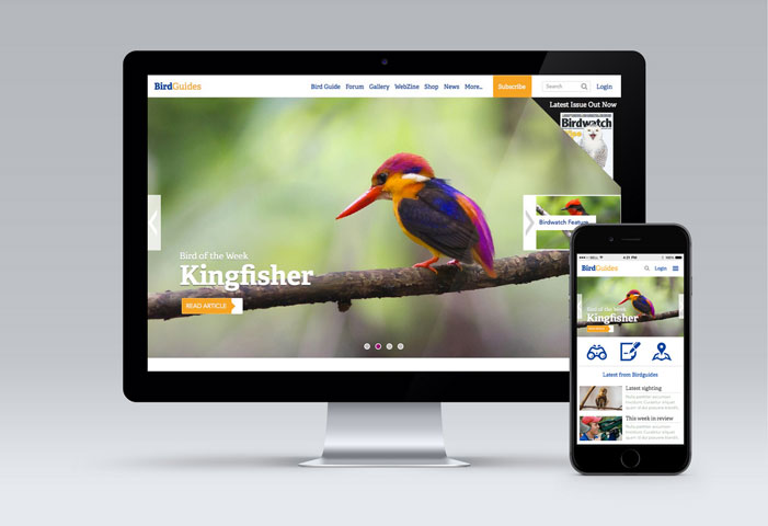
Click the image below to demo our visualization software and see an example of Responsive design ideas

- Charles House, 18 Charles St, Truro,
Cornwall, TR1 2PQ, United Kingdom - +44 (0)1872 321177
- info@affinity-digital.com
